Hotel Tonight teardown: trigger and room analysis
Tweet
rss
Background - Triggers
This week, I have been reading a book called Hooked, which is about building habit forming products by Nir Eyal (who also writes about it in his blog nirandfar.com).
In this post, I take a quick-pass analysis of an email I got from Hotel Tonight, an email which was an external trigger to goad me to act. The focus is not so much on habit formation, as general product and trigger observations.
A lot of us go through the day and do things automatically, because we have been conditioned to do so. The first step to such conditioning is a trigger. To use an example (from the book), before you became addicted to Instagram, you first became aware through an external trigger, such as an Instagram picture posted on your friend's Facebook wall. Once you become a regular user, you find yourself opening Instagram to capture and share a beautiful moment. This describes a transition from external to an internal trigger. Instagram has got you! As the saying goes: “we are what we repeatedly do.”
Hotel Tonight Email Trigger
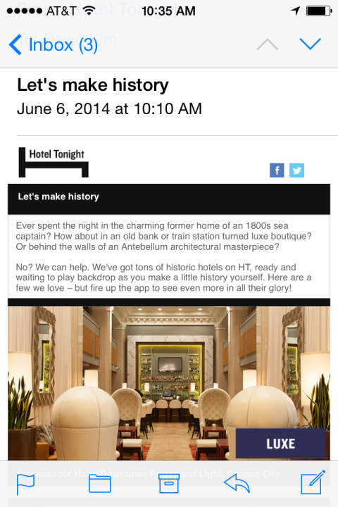
So, Hotel Tonight sent this email, and I woke up to it in my inbox.
Email: Hotel Tonight
Notice the copy language used. “Let's make history” and the last sentence “fire up the app to see even more …” Clearly, the language is intended to move you to act.
It is also clear, the big emphasis is on visual language. The first image is a beautiful perspective of a luxurious hotel lobby looking into a high-end bar. It beckons your aspirations - “would you not want to walk into this stylish, high life?” - the image suggests.
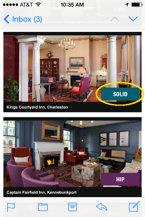
As you scroll down, you see different hotel room types. In the following two room types, you notice the box in the lower right corner “HIP” and “SOLID (yellow circle).”
HIP and SOLID rooms
Alright. My curiosity sufficiently stoked, I open the mobile app. The email trigger successfully lead to action.
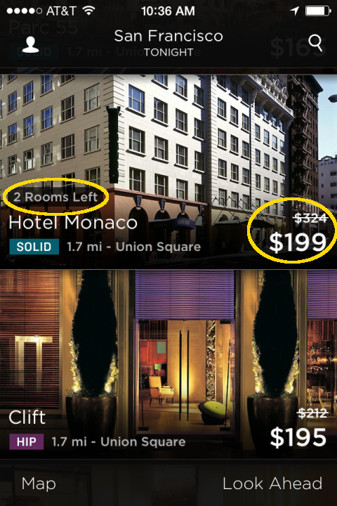
Room types and images are complemented with room prices.
You can find a few techniques in the image above intended to move the rooms (i.e. action triggers).
-
The first is bargain hunting. See how the room price has been cut from $324 to $199.
-
The second is scarcity. Notice that there are only 2 rooms remaining at Hotel Monaco. Get this room now before it is sold out!
Room Categories Confusion
I have to say that I am puzzled by the product team's decision around room categories.
-
First of all, how should the user decipher the room categories and the colors? Does the intended user use the app often enough to be able to associate the colors with the categories?
-
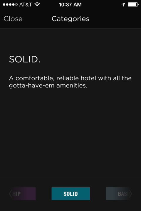
Are the catgory names themselves intuitively defined? I had no idea what “SOLID” meant. I fumbled around the app to find what it means in this next screen shot.
Solid is a comfortable, reliable hotel with all the gotta-have-em amenities.
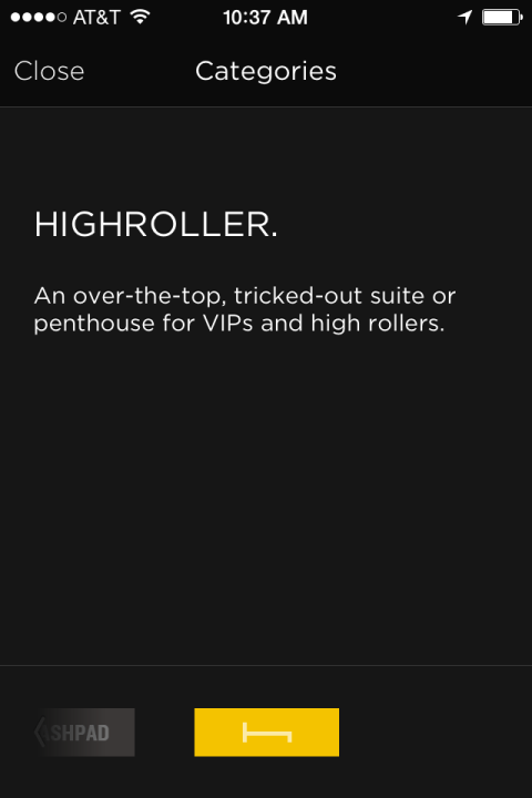
There is another categeory called Highroller. Once again, you kind of know what this means, but not really.
This is not me. Is it you?
So this brings up all a few questions:
- What problem is the product manager trying to solve with these categories?
- Is HT currently serving room types based on past user transaction history or generically?
- If the intended action is click, are the room categories an effective trigger?
- How does the color coding relate to UX?
Compare Airbnb
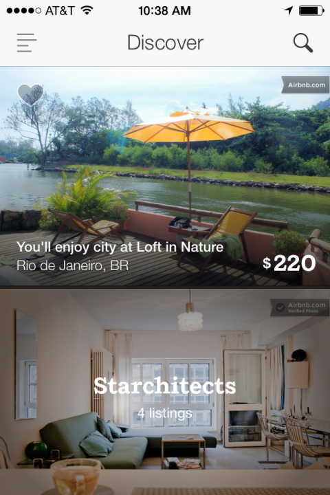
Compare Airbnb. If the catgories are intended to trigger something, it is interesting to note that Airbnb approaches this problem narratively: “You'll enjoy city at Loft in Nature.”
Airbnb landing page.
The aspirational imagery subtly leads to an internal trigger. Next time you think about vacation, you may find yourself going to Airbnb to browse.
One final question for both Airbnb and Hotel Tonight is, given the observation that human beings attract attention, why are people missing from the picture?
Imagine that top image, with an attractive bartender staring squarely at you, or the Airbnb deck, with a playful gal sipping from a cup, living the good life. Now, wouldn't you like to be there?
More
If you liked this post, you may want to try a comparative mobile app teardown screenshots for Airbnb and Hotel Tonight. Give it a try, annotating what you see in detail, and improve your product sense in the process.
Suggestions?
What do you want to talk about? Send your suggestion! If you found this useful, please share it and subscribe.
comments powered by Disqus
Get new posts via email:
About David

David at Crater Lake National Park
Read recent posts
- Guides to help you think like a hacker even if you don't program
- Mapping Your Career
- Does your company Quora?
- Mobile product teardown TripIt vs TripCase
- Hotel Tonight teardown: trigger and room analysis
